

Version: 1.1.0
Latest Update:
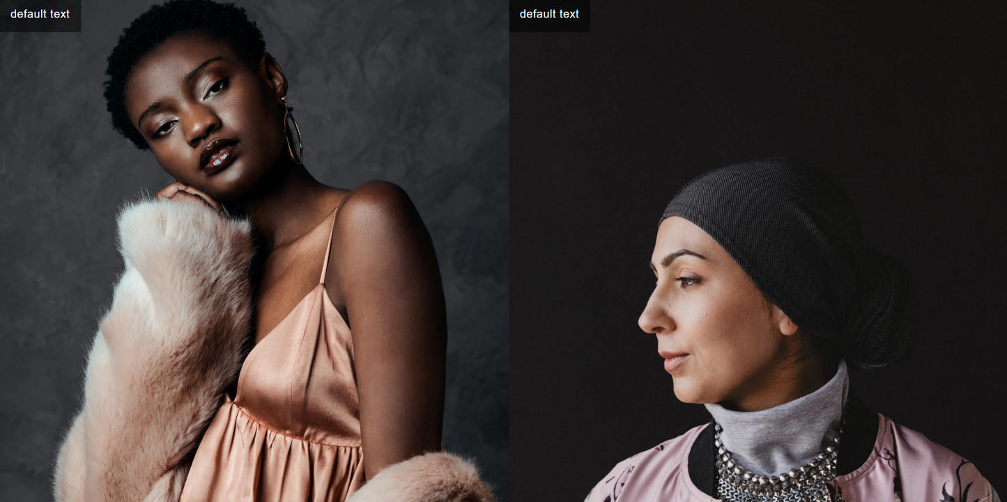
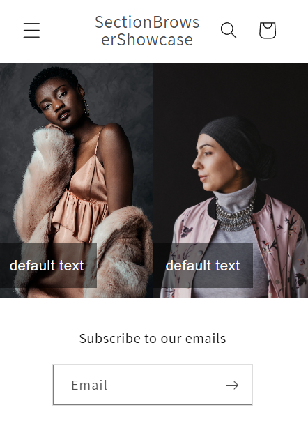
TWO IMAGES FULL WIDTH | ALWAYS SIDE BY SIDE | MOBILE & DESKTOP
TWO IMAGES FULL WIDTH | ALWAYS SIDE BY SIDE | MOBILE & DESKTOP
Regular price
$5.78 USD
Regular price
Sale price
$5.78 USD
Unit price
per
Taxes included.
Download Available in less than 2 minutes
Couldn't load pickup availability
Two Images (Always Side by Side)
This section displays two equal-width images, each with an optional overlay text box and an individual click-through link. Ideal for split hero layouts, A/B category call-outs, or editorial image pairs.
Key features
- Side-by-side layout — images stay 50 / 50 on all screen sizes (no stacking).
- Independent links — each image can navigate to a different collection, page or external URL.
- Overlay text boxes — add short copy, promos or calls-to-action on top of each image.
- Responsive overlay position — text appears top-left on desktop, bottom-left on mobile for maximum readability.
- Object-fit cover — keeps full-bleed look regardless of the original photo dimensions.
- No JavaScript required — pure Liquid + CSS for lightweight performance.
Editable settings
- Image picker (per block)
- Image link URL (per block)
- Image alt text (per block)
- Overlay text (per block)
- Overlay font stack (per block)
- Overlay font size (px) (per block)
How to add the section
- In your Shopify admin, go to Online Store › Themes, click the kebab menu (⋮) next to your theme and choose Edit code.
- Inside the sections folder, click Add a new section.
- Name the file:
two-images.liquidand click Create section.
3.5. Remove the existing placeholder code. - Copy the entire code from this repository and paste it into
two-images.liquid, replacing any starter code. - Click Save.
- Open the Theme Editor (Customize), click Add section, and choose Two Images Side by Side.
- Upload two images, enter overlay text, set optional links and typography, then save your theme.